Depict National-Scale Energy Systems
Lawrence Livermore's flow charts illustrate the complex relationships among energy, water, and carbon to help people understand the structure of the nation's energy system.
Energy, Water, and Carbon Informatics
Lawrence Livermore National Laboratory (LLNL) produced the first diagrams illustrating U.S. national energy use in the mid-1970s. LLNL has also published charts depicting carbon (or carbon dioxide potential) and water flows at the national level as well as energy, carbon, and water flows at the international, state, municipal, and organizational level. Flow charts are single-page references that contain quantitative data about resource, energy, and byproduct flows in a graphical form. These flow charts help scientists, analysts, and other decision makers to visualize the complex inter-relationships involved in managing our nation's resources.
Relationship to Livermore's Mission
LLNL advances the nation's security by innovating science and technology solutions to improve energy security while reducing environmental impact. The energy flow charts assist decision-makers as well as the general public in understanding energy usage and its affect on the economic security of the United States. They also provide a means for developing opportunities for the long-term sustainable use of energy.
From Industrial Revolution to Now
Civilization gets its energy from various sources and uses it to power a broad range of activities. Water cycles naturally throughout the Earth, and humans divert it for a wide set of applications. Some energy uses result in carbon emissions, which affect Earth's climate. Lawrence Livermore has been producing one-page charts that summarize these flows for decades.
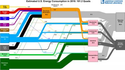
In the 1970s, during an era of rapidly growing awareness of the cost of energy, scientists at Livermore first adapted the Sankey diagram to depict quantitative data describing U.S. energy generation, flow, and end uses. (Sankey diagrams date back to the 1800s and were used during the industrial revolution to map the flow of raw materials and finished products into and out of factories.) The changing economics of energy created the need to understand how much energy the United States uses from coal, petroleum, nuclear, and renewable sources, and how that energy is diverted into commercial, industrial, residential, and transportation-related end uses.
Livermore Leads in Visualization
To develop the first chart of U.S. energy use, Livermore's experts turned to the Sankey diagram for its versatility in displaying quantitative information visually. Every line's width is proportional to the quantity of energy used by a particular sector in quadrillion British Thermal Units (BTUs), a unit that quantifies all forms of energy from heat to electricity, equivalently. Lines are color-coded according to the form of energy.
Efficiency Improvement Made Visible
The lines flow from resources (left) to disposition (right) (see image on front), where they diverge in proportion to how much energy from each resource powers the four major end-use categories (residential, commercial, industrial, transportation), or become rejected energy. Energy services are a measure of the energy efficiency (useful work output) of various processes. No energy-using device is 100 percent efficient; both basic physics and engineering limitations result in some energy being wasted. This rejected energy ultimately takes the form of waste heat transferred to the environment. Improving energy efficiency through better design and operation is an opportunity to reduce civilization's energy use without sacrificing energy services.
Lawrence Livermore's energy flow charts ultimately became a yearly release. The development team combined data from the Energy Information Administration with its own software to generate updated charts of the United States' and individual states' energy use annually. The charts, which are also available for many other countries, depict solar, nuclear, hydroelectric, wind, geothermal, natural gas, coal, biomass, and petroleum energy.
Water and Carbon Join the Mix
In the 1990s, at five-year intervals, flow charts of water use in the United States and individual states became available. These charts provide a simplified map illustrating usage of fresh and saline surface water and groundwater in domestic, commercial, and industrial applications, as well as for irrigation and cooling of power plants. This final use of water, named "thermoelectric cooling," is responsible for more than 50 percent of withdrawals from surface water in some areas of the country. The water flow charts also track the fate of water, be it consumption (mostly by evaporation), return to rivers and lakes, or discharge to the ocean.
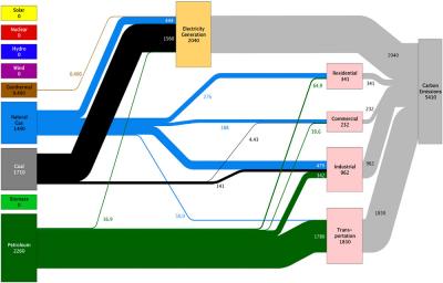
Beginning in the early 2000s, the carbon flow charts map the carbon emissions from their physical sources—mostly coal, natural gas, and petroleum—and attribute the proportion of these emissions to each of the major end uses.
A Cross-Section of the World
Today, Livermore's flow charts (available online at https://flowcharts.llnl.gov) are used by a wide array of people and institutions. Users include anyone who needs to understand national-scale energy and water systems. Federal, state, and municipal energy organizations use the charts as do the private sector, nongovernmental organizations, and institutions performing energy research and development. Teachers from middle school through college use the charts to engage students, and news organizations see them as an easy-to-use source of information.
Now in their fifth decade of production, these charts continue to help users. As to the near future, Livermore is developing a new set of flow charts depicting the interdependence of energy and water. As the world seeks to improve its resource efficiency, this Livermore service will help provide the knowledge needed to move toward a more sustainable model of resource use.


